The dashboard is user-specific, meaning each user can customize the layout, filters, and metrics to focus on the data most relevant to their role and goals.
Accessing the Dashboard
You can access your Reporting Dashboard in two ways:
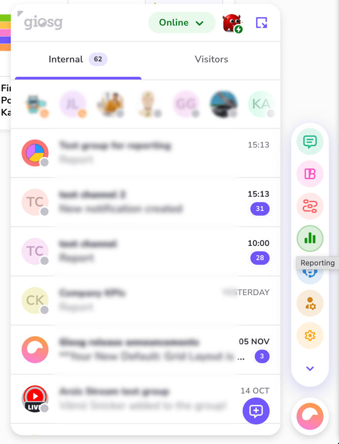
- Main Navigation: Click the "Reporting" link in the main system navigation menu.
- Direct URL: Navigate directly to the dashboard at: https://reporting.giosg.com
Dashboard card data sources (Card Types)
The dashboard supports two primary categories of metric cards:
|
Card Type |
Data Source |
Example Metrics |
|
Conversational Reporting |
System-wide data (web analytics, chat activity, custom events and goals). |
Unique Visitors, Page Views, Shopping Cart Conversion Rate, Number of Chats, Calendar Bookings, Goals. |
|
AI Chat Labeling |
Metrics generated by the AI Chat Labeling feature (e.g., sentiment, classification, text extraction). |
Sentiment Analysis Results, Topic Distributions, Lead Quality Tags, Numeric Scores. |
Dashboard Customization and Management
Creating or Managing Metrics
To make more metrics available in the "Add Cards" list, you must access the settings area:
- Click the three-dot menu (...) in the top right corner of the dashboard page.
- Select the "Reporting Settings" option.
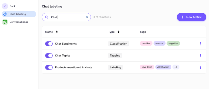
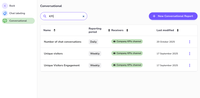
- This section allows you to define and manage both AI Chat Labeling metrics and Conversational Reporting metrics.
- Refer to the AI Chat Labeling documentation or Conversational Reporting documentation to learn more about how to create the metrics.
List of AI Chat Labeling metrics:
Conversational Reporting metrics:
Adding New Metric Cards to dashboard
Metrics must be created in the Reporting Settings before they can be added to the dashboard.
- Click the three-dot menu (...) located in the top right corner of the dashboard page.
- Select the "Add Cards" option.
- A side panel will open displaying a list of all available Conversational Reporting and AI Chat Labeling metrics.
- Select one of the metrics you wish to add and click the plus icon next to it.
- Choose Visualization: Select the preferred visualization type (e.g., bar chart, pie chart, line graph, simple number) for the selected metric. Note that available visualizations depend on the metric's data type.
- Click the “Add card” to place the card on your dashboard.
Reordering and Layout
You can easily customize the layout of your dashboard:
- Drag and Drop: Card positions can be freely changed by clicking and holding the card header and dragging it to the desired location on the dashboard.
Data Filtering
The dashboard provides filtering options to drill down into specific data sets.
Filtering by Date Range and Room
You can apply filters across your entire dashboard view:
- Date Range Filter: Select a specific period (e.g., Last 7 Days, Last Month, Custom Range) to analyze trends over time.
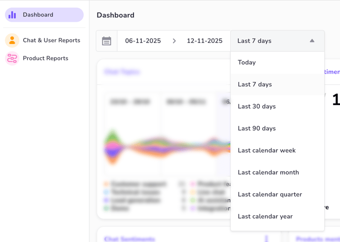
- Room Filter: Apply a filter to restrict results to metrics originating from one or more selected rooms. Note that not all metrics are room specific and the filters wont affect those. Metrics that are filtered will have a label indicating the filter is applied.
- To add a room filter click the filter menu on the top right corner of the dashboard.
Filter Application and Indication
- Filter Scope: The Room Filter is NOT applied to all Conversational Reporting metrics. Some system-wide metrics (e.g., Unique Visitors) are not room-specific and will show the global value, even when a room filter is active.
- Filter Icon: For any individual metric card that supports the applied filter (Date or Room), a visible filter icon will appear on the card header to confirm that the displayed results are filtered.
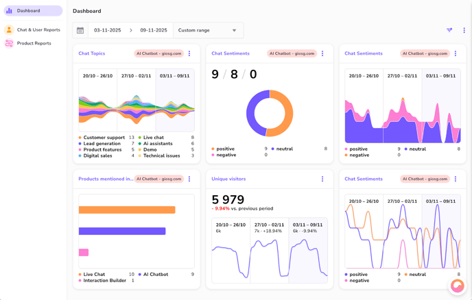
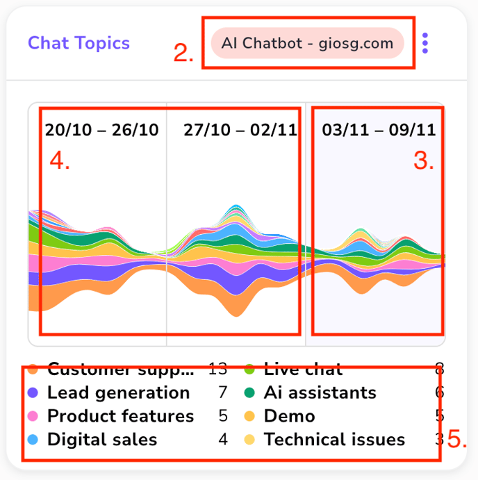
Metric Card Anatomy and Visualization Types
Every metric displayed on the Reporting Dashboard is housed within a Metric Card. While the visualization within the card changes based on your selection, most cards share a set of common informational elements.
Common Elements of a Metric Card
|
No. |
Element |
Description |
|
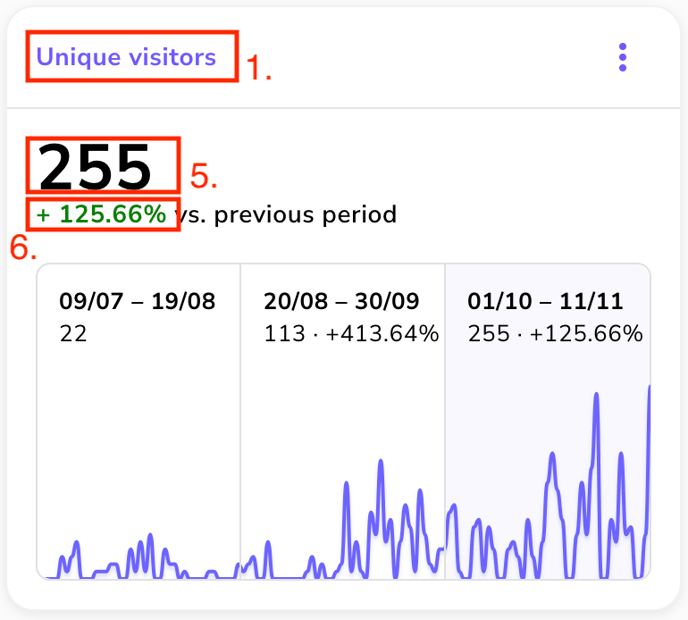
1. |
Title |
Displays the human-readable Name of the metric, as configured in the Reporting Settings (e.g., "Chat Intent Classification," "Web Unique Visitors"). |
|
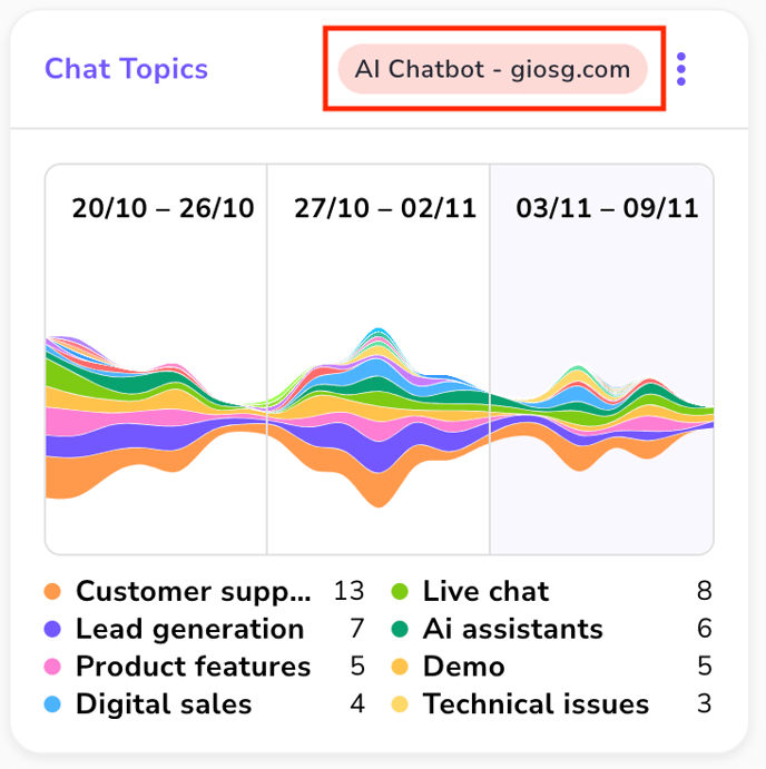
2. |
Applied Filters |
Located in the top right corner of the card header. A filter icon appears here when the dashboard's global room filters are actively applied to the metric's data. |
|
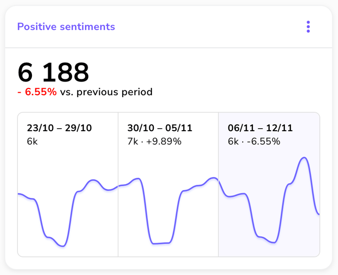
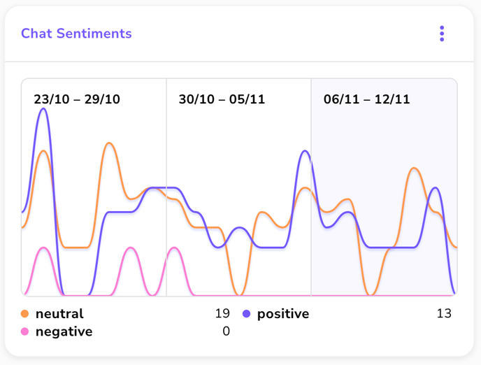
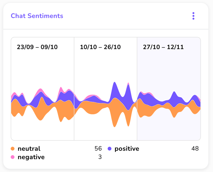
3. |
Current period |
Show the current period's data, its total value and change to the previous same length period. This same information can be shown in the “Total number” field with a bigger size also. |
|
4. |
Previous periods |
Show two previous periods of the same length as the currently selected period for easy comparison of the results over time. |
|
5. |
Legend |
Shows the values of the different data points in the visualization. Legend is not visible on all kinds of visualization types. |
|
5. |
Total Number |
A prominent figure displaying the total aggregated result for the currently selected date range (e.g., total number of chats, total goals or unique visitors). |
|
6. |
Change Percent |
Shown directly below the Total Number. This figure indicates the percentage change in the metric's total value compared to the previous period of the same length. |
Visualization Types
You can customize how each metric's data is presented. The availability of these options is constrained by the data format of the metric (e.g., you cannot use a Pie chart for a Text metric or a metric which has a single value like Unique visitors).
|
Visualization Type |
Best Use Case |
Key Features & Constraints |
|
Line |
Tracking trends and volume over time (e.g., daily chat counts, weekly conversion rates). |
Supports Ranges comparison (Current, Previous, Second Previous Period). Ideal for time-series data. |
|
Pie |
Analyzing proportions and distribution of categorical data (e.g., Classification or Labeling metrics). |
Shows the distribution of a total into discrete segments (classes/labels). Not suitable for time-series data. |
|
Bar |
Comparing discrete values (e.g., Visitors per device type). |
Excellent for showing magnitude or volume comparison between categories at a single point in time. |
|
Area |
Tracking cumulative volume over time, often used to visualize parts of a total. |
Similar to a Line chart but fills the area beneath the line, emphasizing total accumulation or component contribution over the selected date range. |
|
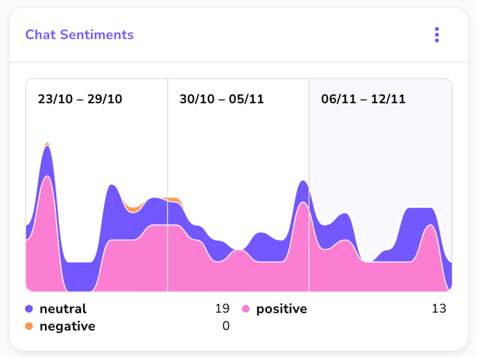
Theme River |
Analyzing the evolution of categorical distributions over time. |
Visualizes how the proportion of different labels or classifications changes across the selected date range. Best for Labeling/Classification metrics. |
|
Multiline |
Comparing the trends of multiple, related metrics or dimensions simultaneously on the same axis. |
Ideal for tracking sub-categories or two different metrics that share a common unit (e.g., two different products' sales volume over time). |
Ranges in Line Chart Visualization
When you select the Line, Multi line, Theme river or Area visualization, the card utilizes historical data to provide powerful, immediate period-over-period comparison:
|
Range Displayed |
Description |
Comparison Basis |
|
Current Period |
The metric's data across the date range selected by the global dashboard filter. |
Base data for all comparisons. |
|
Previous Period |
The metric's data from the period immediately preceding the Current Period, of the same length. |
Used to calculate the Change Percent figure displayed on the card. |
|
Same Length Period Before That |
The metric's data from the period preceding the Previous Period. |
Provides deeper context for long-term trend analysis. |
Example of line chart:
Example of multi line chart:
Example of theme river chart:
Example of area chart:
Example of bar chart:

Example of pie chart:
