In our experience, keeping the following in mind helps you reach better engagement for your popups:
Place it right
Target it right
Make a clear flow for the content
Make it visually appealing
Offer an easy exit
Place it right
When using popups, you have two main options on how to grab the attention
of your visitor:
- Middle of the screen popup - these are effective for gaining maximum visibility for your popups. These are hard to ignore as a visitor.

- Attached to the side of the screen - a more subtle approach,which might get less visibility, but cause less irritation.
Place your interaction by clicking your interaction background , then click the “Appearance” tab and position your interaction from the map. You can adjust the placement with the “Offset” pixel amounts.
Add a sliding entrance animation to gain more visibility for popups attached to the side of screen. Click the white canvas → Choose “Animation” from the panel of the right.
Target it right
Timing is everything to reach a high conversion rate. Make sure the visitor has a chance to look at your website content before presenting the popup, otherwise you might interrupt their experience. Target the popup to be shown on the pages where the content is relevant and time the popup to appear after the visitor has spent at least 10 seconds on the chosen pages.
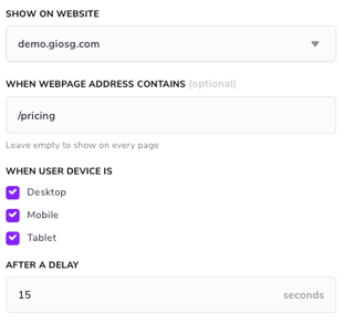
When publishing the interaction, add the right page URL in the “When webpage address contains” field. In the “After a delay” field add the number of seconds which after the popup will appear on the site.
Need to target your popup to several pages? Check out our guide on how to use several URLs in the same rules condition.
From the “User device is” field you can choose on which devices the popup is shown on. This allows you to create separate popups/interactions for separate devices. You can switch between a desktop and mobile view in the “Design” phase and preview your popup on different devices in the “Preview” phase.
Check from the giosg reporting which devices your visitors use: service.giosg.com → Reporting → Visitors → Visitors and devices.
Make a clear flow for the content
Your popup content should follow the same structure as your landing pages:
- Get the attention of your visitor
- Give a simple value proposition
- Offer a call to action
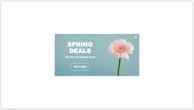
Use a big font for your attention grabbing headline in the popup and state the value proposition there (“Our Black Friday offers are here”). Make sure that there is a clear action for the visitor, in the form of a call to action button: (i.e. “See our offers”). Use the action: “URL” to redirect the visitors to the right page.
Make it visually appealing
Using images in your popup is a sure way of making the content interesting. Adding images of people has been proven effective in web page design, and popups are no different. Add a picture element to your interaction from the panel on the left and double click the element to upload your own image.
Offer an easy exit
When the popup does not resonate, there should always be an easy way to close it down for the remainder of the session. Thus, make sure to have a button with the “Exit” action in your popup. Add a button element from the panel on the left on the design page, and choose the “Exit” action from the panel on the right.