![frame_partymode-1.png]](https://support.giosg.com/hs-fs/hubfs/frame_partymode-1.png?height=40&name=frame_partymode-1.png)
Introduction
The accessibility settings in Interaction Builder can be used to make digital content more accessible to everyone . This article goes through these settings one by one and complements the "Get started with accessible interactions" guide that includes a shorter list of the key building blocks of accessible interactions.
Content
2. Interaction navigation order on page
5.1 Text element types and hierarchy
5.2 Hiding texts from screenreaders
............................................................................................
1. Accessibility warnings
Interaction builder helps you make accessible interactions by on the Publish-page highlighting settings that you may want to review.

These warnings should be seen as tips provided by the tool rather than errors that have to be fixed. You can for example see warnings that:
- Point to missing labels
- Highlight views that have keyboard trap
- Recommend an element type (see article: "Interaction elements") that might be better to use (for example to use a button element instead of an image)

Clicking on the warning will take you to the element that the warning is connected to. The warning automatically disappears if you change the setting mentioned in the warning.
If the warning is not accurate for your specific interaction (the warning for example points to a missing label for an image element, but you want to leave it empty for screen readers to ignore it) you can dismiss the warning. Dismissed warnings will then be moved to the "Dismissed warnings" section, making it easier for you to keep track of which warnings still require your attention.

The accessibility warnings are meant to highlight settings in your interactions that you may want to review. Wether they need to be resolved ultimately depends on your use case and the structure and content of your interaction.
2. Interaction navigation order on page
For users navigating websites by tabbing, logical tab order is important. By default, interactions are the last item in the website tab navigation order. If you want to change this, you can force it to be first by enabling the "Inital focus on keyboard navigation" advanced setting. This increases the tabindex of the interaction element.

When interactions are exited (visitor clicks on an element with Exit-action) focus is automatically restored to the very first element on the website.
3. Keyboard trap control
Assisted users need to be able to navigate web pages using a keyboard, usually by moving forward and back with the Tab (+Shift) key. However, subsections of a web page, such as popups, often need to keep the user focus within the section. They don’t allow users to move away using the navigation keys. This is known as a Keyboard Trap. Instead, popups and such usually have a button for closing the pop-up and escaping back to the page.
Interaction Builder provides a Keyboard Trap setting for each view. It should be disabled for chat button views and other views that have no close button, allowing the visitor to leave the interaction with the keyboard.
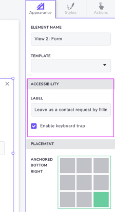
The keyboard trap setting can be found on the Interaction Builder Design page and is set per view. Select a view and navigate to the Appearance tab on the right side of the page. "Enable keyboard trap" can be found in the Accessibility section.
4. Accessibility labels
Some assisted users use a screen reader that speaks the web content to them. For this purpose, Interaction Builder provides a variety of readable text label (aria label) settings.
4.1 Interaction labels
To set a label for the entire interaction, click on the interaction name at the top of the design page and use the "Interaction name for screen readers" field.

This allows you to have a separate internal working title for the interaction, and choose another external description for it. If no label is set, the interaction name will be used instead.
4.2 View labels
When setting an accessibility label for the entire view, the label will be the first thing to be read when the view is opened. Select the view and head over to the Settings tab to add your label.

4.3 Element labels
If an accessibility label is set for an element, it will be read to the user when they navigate to the element. So for example for buttons, the label would be read instead of the button text when keyboard focus is moved to the button.

For images (which can be purely visual elements), the element is ignored if no label is set.

It depends on the element and its original text if an accessibility label is needed. If you need to see the context of the button to understand its purpose, adding a separate label for it is a good idea. For instance, if you have a contact form and a button that says "Send", the button might not make too much sense if you cannot see the form. Hence, using an accessibility label like "Send the form and move to the next step" can be set.
4.4 Link titles
When using links in which the link text itself is not that descriptive, a title can be given to the link. The titles are shown as tooltips for desktop users and will be read by screen readers.

5. Text elements
It is always good practice to have text elements with sufficient contrast to the background as well as to use font sizes and fonts that are easy to read.
Text elements are by default always read by screen readers and they are all marked as "body text". These can be overridden by changing the text element types for individual elements, or to set elements to be be ignored by screen readers.
5.1 Element types and hierarchy
Interaction builder allows you to give your text elements structure by defining the type of the text element; Title, Heading, Subheading or Body.

This type of structure gives meaning and hierarchy to the content and helps assistive technologies understand how the content is organised, making it easier to navigate.
5.2 Hiding texts from screen readers
Sometimes you might have a text that you want screen readers to ignore. The reason for this might be that you have other elements (like buttons) overlapping with your text element and using labels for those buttons is a better solution.
You can set a text to be ignored by enabling the "Hidden from screen readers" selection in the text element settings.

5.3 Text scaling
To comply with accessibility standards, websites must allow visitors to adjust font sizes using their browser settings. Also interaction text sizes scale, when browser font size is adjusted.
How do we do this? We convert the pixel values set in the Interaction Builder into their equivalent rem units and use the base font size defined on the website to perform the conversion (if not set, we use the browser default of 16px). In cases where the client forces font sizes using fixed pixels, we preserve the pixel values and disable the accessibility scaling feature, since scaling wouldn’t be meaningful.
The font size scaling feature can be enabled/disabled per interaction. This is done directly from an interaction's settings with the "Use relative font size to allow text resizing" setting.
- When enabled (checked): The interaction attempts to convert pixel values to
remunits, allowing text to scale in response to user browser font size adjustments. - When disabled (unchecked): Font sizes remain fixed in pixels (
px), effectively disabling the accessibility scaling for that interaction. This can be necessary if:- The base font size on the website is defined using calc() or % values.
- Website styles are defined in external stylesheets that are inaccessible due to CORS restrictions.