![frame_partymode-1.png]](https://support.giosg.com/hs-fs/hubfs/frame_partymode-1.png?height=40&name=frame_partymode-1.png)
This article lists some of the key things to keep in mind when building accessible interactions. Please visit this article for a more thorough guide on the different accessibility related features in Interaction builder.
- To begin with, if you when you open your interaction are seeing a prompt to Convert the interaction, please click the green Convert button. This updates the interaction to a new version, which applies several under the hood improvements to it.

After this, you can continue working normally with the interaction. - Use colors with enough contrast and texts with a decent font size in your interactions.
- Use accessibility labels where necessary. These help also visitors navigating the website with tabulators and screen readers to navigate your content, even without seeing it. The most commonly used labels are for individual elements, but you can also set labels for views (label is announced when view changes) or the entire interaction.

- Use the correct element type for the elements in your interaction.
- Only use button elements in elements that will actually be used as buttons (have click actions).
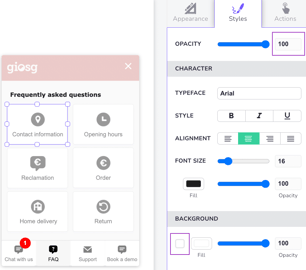
- If you have clickable elements that are transparent, rather use 100% opacity and remove the background fill (instead of the other way around).
- If you have clickable elements that are transparent, rather use 100% opacity and remove the background fill (instead of the other way around).
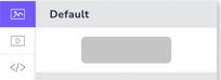
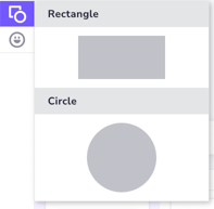
- If the element will not have any actions, use for example a shape element or an image element for purely visual parts of your interaction, depending on what type of content you’re creating.
- If you want to have some non-clickable text in the interaction, use a text element.
- Only use button elements in elements that will actually be used as buttons (have click actions).
- Think about how your labels and text elements work together. If you have text elements that loose function for people that are not visually consuming the content, consider to hide them from screen readers.


- To have the tab order of clickable elements in the interaction to be logical (left to right, top to bottom) pay attention to the anchoring of the elements.
- Make sure that your elements are anchored correctly; elements at the top of the interaction are anchored to the top etc. The navigation of clickable elements works from top to bottom.
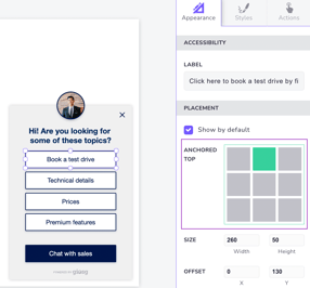
- Make sure that your elements are anchored correctly; elements at the top of the interaction are anchored to the top etc. The navigation of clickable elements works from top to bottom.
- Be mindful where you use a Keyboard trap. A rule of thumb is to avoid them in views with no Close-buttons (buttons that would have an Exit-action or a Change view-action to another view without keyboard trap).
Visit the "Accessibility settings in Interaction builder" for more information on these settings.