![frame_partymode-1.png]](https://support.giosg.com/hs-fs/hubfs/frame_partymode-1.png?height=40&name=frame_partymode-1.png)
You can change the styles of different elements under the Styles tab on the right side panel in Interaction Builder. The adjustments vary depending on the element chosen, but here you can adjust all visual aspects like typefaces, colors and images.
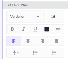
Text settings
For text elements as well as buttons you can adjust the the text settings such as typeface, styling, alignment and colour. To upload your brand fonts click the typeface dropdown and “Custom fonts…”.
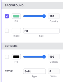
Background & Borders
In the background section you can change the fill colour of an element. You can also upload an image by clicking the image box and change the scaling of the image.
If you want to add a border colour for an element that can be done in the borders section.
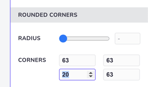
Rounded corners
You can adjust the corner radius of elements in the rounded corners section.
By using the radius slider you can change the radius of all corners of the element at once. Each corner of an element can also be adjusted individually: if you want to change the rounding of only one corner, use the number input field.
Setting a radius for one or more of the individual corners clears the common value set by the slider. If the slider is moved, the slider value will override the individual values.
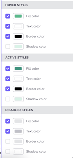
Different states of elements
For some elements you can choose different styles for different states. For buttons you can set hover as well as active and disabled styles. For radio buttons and check boxes you can choose unselected and selected styles, as well as validation colours.